內容簡介
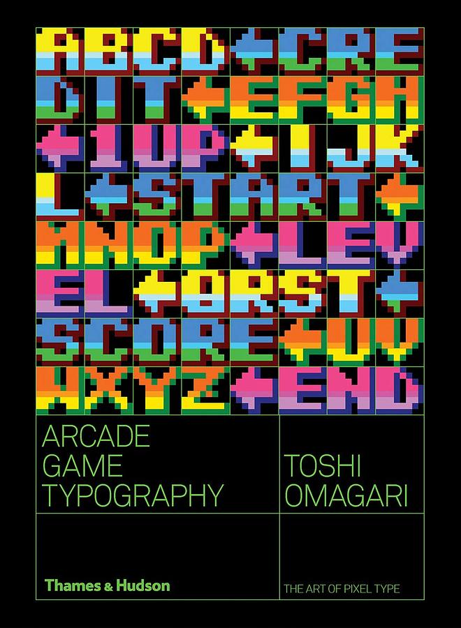
內容簡介 Arcade Game Typography presents readers with a fascinating new world of typography – the pixel typeface. Video game designers of the 70s, 80s and 90s faced colour and resolution limitations that stimulated incredible creativity: with letters having to exist in an 8x8 square grid, artists found ways to create expressive and elegant character sets within a tiny canvas. Featuring pixel typefaces carefully selected from the first decades of arcade video games, Arcade Game Typography presents a previously undocumented ‘outsider typography’ movement, accompanied by insightful commentary from author Toshi Omagari, a Monotype typeface designer himself, and screenshots of the type in use. Exhaustively researched, this book gathers an eclectic typography from hit games such as Super Sprint, Pac-Man, After Burner, Marble Madness, Shinobi, as well as countless lesserknown gems. The book presents its typefaces on a dynamic and decorative grid, taking reference from high-end type specimens while adding a suitably playful twist. Unlike print typefaces, pixel type often has bold colour ‘baked in’ to the characters, so Arcade Game Typography looks unlike any other typography book, fizzing with life and colour.
作者介紹
作者介紹 Toshi OmagariToshi Omagari is a typeface designer at Monotype UK. He studied typography and typeface design at Musashino Art University in Tokyo, graduating in 2008. Arcade Game Typography is his first book. Kiyonori Muroga established his career as editorin-chief of IDEA magazine, a Tokyo-based publication focused on graphic design and typography with a global cult following. Muroga-san left IDEA in 2018 to pursue new ventures in writing and publishing around graphic design.